Writing days
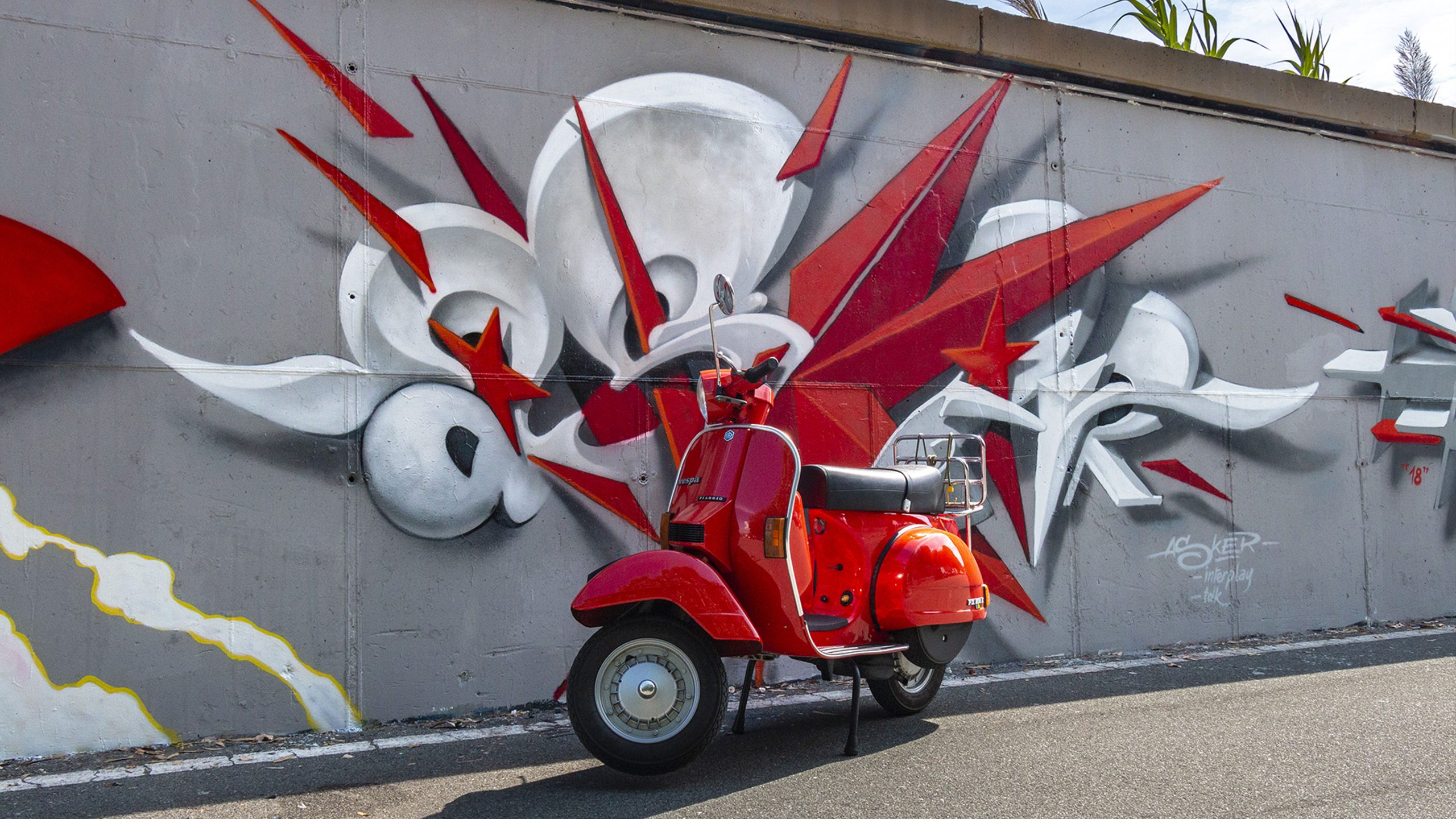
The polygonal explosion.
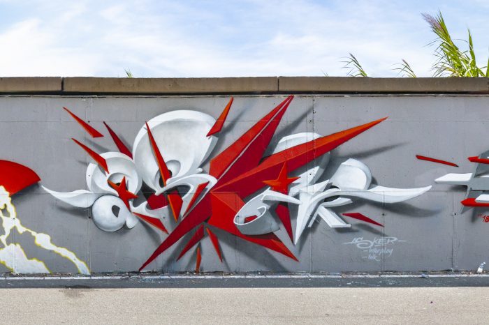
“The fundamental model is the three-dimensionality of the letter focused on the use of accentuated perspective and on an almost “sculptural” or architectural representation of the name of the writer. Currently, the artist’s mural production is centred on the creation of sinuous and curvilinear moving forms, where a strong spaciality exists, as if the wall becomes an architectural backdrop. The lettering is thus transformed into an image that is both abstract and material at the same time. The name becomes difficult to read because it consists of barely recogisable structures but on the other hand its presence gives rise to its three-dimensional evolution and extrusion, as it emerges from the wall. To all this are added elements of transparency and incompleteness, which accentuate the perspective and make his works exceptionally elegant.”
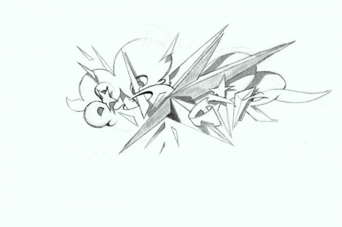
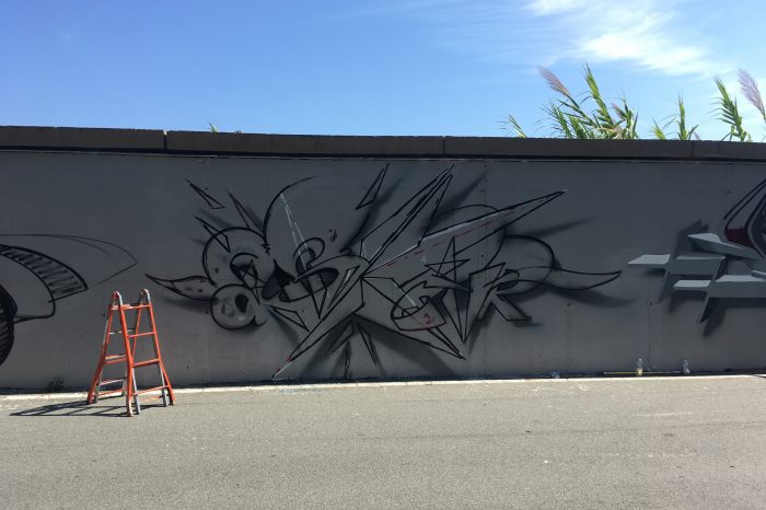
This extract from a critique by Giada Pellicari describes the work precisely, which can therefore be defined as a stylistic synthesis in Asker’s production. The chromatic choice of white and red is a recurring element, while the filiform and curvilinear features (called “leaves”) present in much of his work, are totally absent. The explosion arising from the letter K, the only letter coloured red, forcefully characterises the dynamism of the work. Another particular and recurring element that we find in this work is the use of the double R, in lower case and in block letters merged one inside the other.
Graffiti writers
Cler, Asker, Weik, Tawa, Dada, Kayone
TDK — Interplay — ACV — 16k — TNP
About
Davide “Asker” Carioni
WOA Creative Company
Via Roald Amundsen 8, 20148 Milan (Italy)Social
Contact


